Theme Settings
Go to Settings → Theme Settings to change the colors used across the admin panel, web and Flutter app. Colors are defined as palettes (shades 50–950), so one base color is enough to generate the full set.
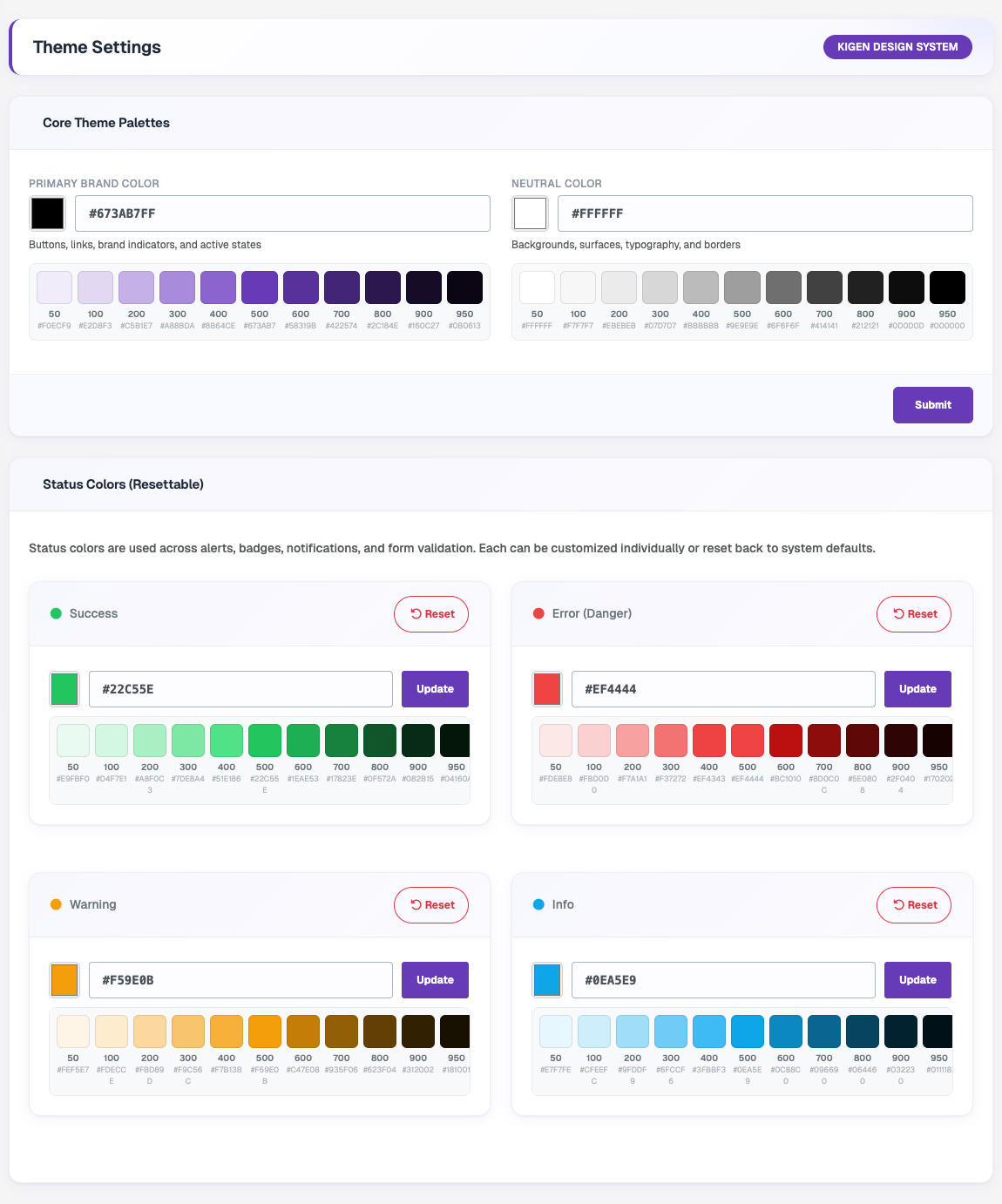
Core Theme Palettes
- Primary Brand Color – used for buttons, links, brand indicators and active states.
- Neutral Color – used for backgrounds, surfaces, typography and borders.
Enter a hex code or pick a color, check the generated shade preview, then click Submit to save.
Status Colors
Status colors are used for alerts, badges, notifications and form validation. Each one can be updated on its own:
- Success
- Error (Danger)
- Warning
- Info
Click Update to save a single status color, or Reset to bring it back to the system default.
tip
For how these colors reach the mobile app, see Change App Theme.